10 December 2010

Simple and Clean

Some days ago I published a review on a remarkable Spanish pen—the Súper T Gester 20. After using it for a while I ran out of ink and proceeded to clean it. This was very easy despite the fact it is a piston filler. The reason, as I pointed out, was that section and barrel attach to each other by a simple thread.


What I had not foreseen was how easy disassembling the piston was. Once the section is out of the way, the piston comes out of the barrel unscrewing the knob further. And that is it!


Easy to disassemble and easy to clean. There are no internal sheaths or hidden screws. In a sense, this pen is an eyedropper with a piston, a very easy piston.


Hats off for the designer Manuel Portus Ribas.

(Kaweco Sport with 1.1 mm stub nib – Diamine Evergreen)

Bruno Taut
(Madrid, December 9th, 2010)
[labels: Súper T, soluciones técnicas]

09 December 2010

Matching (III)

The controversy is always there: Is that pen original or a copy of another? Which company did father that idea?

The Sheaffer Balance is a well known pen from the thirties, marketed in 1929, though—about which there is a lot of information. That pen combined a number of features to make it very attractive and a success—lever filler, colorful celluloid bodies, “torpedo” shape, lifetime guarantee…


Becoming an icon it was bound to be copied and imitated. The pen I am using to write this chronicle is one of them.


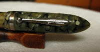
It is a lever filler called Hawaiian: "Registered Practical Pen", the inscription on the barrel says. It is made in green celluloid and follows very closely the design patterns of the original Sheaffer, including the white dot sign for lifetime warranty.


The white dot!

The main difference lies on the nib. The Hawaiian uses a very rigid and apparently untipped steel nib. However, it is fairly smooth.


The inscription on the nib reads "Hawaiian / PRACTICAL / GOLDEN PEN / -<5>- / S. Y. S. Co."

I bought it through an online auction thinking it was a Sheaffer Balance. Only once I got my hands on it I discovered the fake. But the price had been cheap and I decided to restore it and now it is a decent writer.

I have no information on this manufacturer.


Hawaiian Balance in green celluloid – J. Herbin Vert Empire

Bruno Taut
Madrid, December 8th, 2010
labels: Sheaffer, Hawaiian

06 December 2010

Matching (II)

The controversy is always there: Is that pen original or a copy of another? Which company did father that idea?

The well-known all metal Pilot pocket pens.

Among pocket pens, the all metal Pilot Myu 701 is the most widely known, and its close relative black stripped pen is one of the most desired.

The black stripped pens by the big three Japanese companies. From left to right, Pilot, Sailor and Platinum.

The jewels on the caps.

On the other hand, the big three Japanese pen companies are always paying a close attention to each other.

The three nibs. From left to right, the Sailor's in 18 K white gold, the Platinum's in golden 18 K gold, and the Pilot steel nib.

Platinum’s version of the black stripped stylus was a pen with a springy 18 K gold nib. The black plastic section and the golden colored nib take some charm away from this wonderful writer.

On its side, Sailor released an all steel pen with black stripes with a very smooth 18 K white gold nib. Again, an amazing and pleasant tool.

The Sailor pen in detail.

I cannot say which of them was the first in seeing the market.

My thanks to Kinno-san

(Hawaiian Balance in green celluloid – J. Herbin Vert Empire)

Bruno Taut
(Madrid, December 5th, 2010)
[labels: Platinum, Sailor, Pilot]

01 December 2010

Petit

Para Aina-chan.

Pen review. Pilot Petit 1.

Pilot Petit 1 are small and inexpensive fountain pens aimed, so Pilot said, at the market formed by high school and college students. It seems Pilot marketed these pens only in Japan, although there are a number of online shops ready to send them anywhere. Interestingly enough, these pens attract the attention of many people, and later they become frustrated for not being able to buy them easily.

The object under review.

1. Appearance and design. (8.5/10)
Pilot Petit 1 are small pens made of plastic. The only metal part in them is the stainless steel nib. I guess we could call them demonstrators as they are transparent. Feed and clip show the original ink color, of which there are 14 different variations.

The overall aspect is very informal, but also appealing. In my opinion, this is an attempt to bring a fountain pen into the realm of kawaii!!!, cuteness, so dear to Japanese youngsters.

The 14 different Petit 1.

2. Construction and quality. (9.0/10)
This is a well made plastic pen. The material shows some flexibility keeping it from cracking. The cap fits perfectly well on the section, when closed, and on the barrel, when posted. The section has four small bumps to ensure this perfect fit, and the barrel has a special form matching that of the cap.

Inexpensive, but well made pen.


3. Weight and dimensions. (7.0/10)
Small pen, but not a pocket pen with the usual design of long cap and short barrel. Nonetheless, as was mentioned before, the cap fits tightly on the barrel to provide the extra length needed to grab it comfortably. However, this is not a pen to write long texts.

The balance is easy to achieve given the very low weight and there is not much difference whether the cap is posted or not other than providing a comfortable length.

Dimensions:
Length capped: 104 mm.
Length open: 90 mm.
Length posted: 129 mm.
Diameter: 13 mm.
Weight: 9 g.


4. Nib and writing performance. (8.0/10)
Rigid steel nib with only one possible point: F. This pen, however, shares the nib with the disposable Vpen, and this one also has the option of a medium nib. The steel nib is fairly smooth and has a very correct ink flow.

A Vpen M nib together with a Petit 1. The red arrow points at one of the bumps to secure the cap in place when the pen is capped. There are four of those on the section.

5. Filling system and maintenance. (6.0/10)
The Petit 1 comes already inked with the matching ink. It uses a special type of Pilot cartridges—smaller than the regular ones. These can be used in other Pilot pens, but regular cartridges —nor any Pilot converter— do not fit inside the Petit 1 barrel. Too petit!

The special cartridge.

This pen, with some minor adaptation in the thread between barrel and section, could be used as an eyedropper.

Nib and feed can easily be extracted from the section by yanking them out. Therefore, the cleaning of this pen is very easy.

The nipple to attach the cartridge to the section.

6. Cost and value. (8.0/10)
This pen costs JPY 300 (plus taxes) in Japan. It is indeed inexpensive and offers a nice performance. The small size might be its main problem.

The other big pen companies in Japan also produce inexpensive pens. Platinum’s Preppy and Riviere, and Sailor’s Ink Pen rally on the same category. However, in my experience, the Petit 1 offers the best writing performance of the group. Filling system-wise, the Petit 1 is the worst as it does not accept any converter, and uses a very special type of cartridges.


7. Conclusion. (46.5/60=77.5/100)
Inexpensive and fun. Good writer save for the dimensions. Correct nib. Being a cartridge-only pen took points away.

(Note added on March 29th, 2012: Second and third generation of Pilot´s Petit 1 introduced some modifications that could affect the grades of this review. One of those changes was a substantial reduction in the price: from JPY 300 to JPY 200).

(Pilot Petit 1 – Pilot Blue Black)

Bruno Taut
Madrid, November 30, 2010
[labels: Pilot, Platinum, Sailor]

30 November 2010

Empty Boxes

Among fountain pen enthusiasts, ball pens do not enjoy much particular favor. One of the arguments is that the essence of a ball pen is an empty box given the fact that the writing object –the ball and the ink deposit— is disposable.

Having this in mind I cannot help taking a critical look at the very successful Pilot Capless or Vanishing Point.

Six Capless pens. From left to right: Red Capless from 1964 with a 14 K gold nib. Dark green model from 1996. This model was on production in different colors between 1973 and 1998. Dark gray, silver colored and red Capless from the 2000s with either steel or 18 K gold nibs. Finally, blue Décimo from 2010 (on production since 2005).

This Pilot model was launched originally in late 1963 and several major changes and improvements have seen the light along its history. The current model in steel and some form of enamel dates from 1998. Since that date, Pilot has marketed a big number of variations including several limited editions. In 2005, a thinner and lighter version of the 1998 Capless was released as a limited edition with the name of Sesenta, and later renamed as Decimo. And in 2006, Pilot marketed the bigger Fermo, with a twisting knob to operate the nib.

Two Capless F nibs in different materials.

But the only variation on those pens lay on the external decoration. The nib (together with the feed and the ink deposit) is exactly the same for all of them, and exchanging them requires no technical ability whatsoever. Therefore, it is possible to change the box while keeping that nib we enjoy so much. Actually, the list of Capless points is quite limited:


In the past, there also existed 14 K gold nibs.

The full gamut of points in Capless nibs in 18 K gold (as of November 2010).

The Pilot Capless/Vanishing Point with all its variations is a big marketing operation backed, of course, by the response of us stylophiles. The Capless, some say, is a very collectible pen, but that obeys, I think, solely to the aspect of empty boxes—just like ball pens.

(Pilot Custom 74 – Pelikan Turquoise)

Bruno Taut
(Madrid, November 30th, 2010)
[labels: estilofilia, Pilot]

29 November 2010

Matching (I)

The controversy is always there: Is that pen original or a copy of another? Which company did father that idea?

I have already spoken in these chronicles about some cases of plagiarism, or coincidence, or inspiration…—the torpedo type of pens á la Montblanc Meisterstück, the capless idea behind the Pilot model, the black pocket pens made by the big three Japanese companies… And there are many other examples. After all, nihil noui sub sole.

Today’s matching couple are two telescopic pens with very different birthplaces. Telescopic pens can be made longer from their compact dimensions in order to become normal in size when expanded. A more detailed analysis of a telescopic pen, a Pilot Short pen with golden nib, can be seen on the Chronicle entitled "Origami".

Capped and contracted.

The older is a Pilot Short Pen originally released in 1968. It came with golden or steel nibs. It uses Pilot cartridges and the CON-20 converter.

Capped and expanded.

The second pen is a Parker Esprit, initially sold as Rotring Esprit during the 1990s. The end of the century sees how Sanford (Newell Rubbermaid’s stationery division) buys Rotring in 1998 and Parker in 2000. Some years later, the Rotring pen is modified to be marketed as a Parker model. As a result, the Esprit now uses short Parker proprietary cartridges instead of the short international ones used by the Rotring predecessor.

Uncapped and expanded.

As is often the case, the Pilot pen is rarely seen outside Japan, whereas the Rotring and Parker pens enjoyed a much wider distribution.

The nibs are very different--semi-hooded on the Pilot, uncovered on the Parker. Pilot Pen also came with a 14 K gold nib, although not in the pen displayed on the picture.

Copy, homage, inspiration or mere coincidence?

My thanks to Kinno-san.

(Parker Esprit – Parker Black)

Bruno Taut
(Madrid, November 18th, 2010)
[labels: Rotring, Parker, Pilot]

28 November 2010

Música

Today I wanted to show some more music nibs (I, II, III). I must confess my attraction for them—on top of being visually very appealing, their writing is a real pleasure. Music nibs are, in essence, a complication on the idea of a stub nib—wide vertical line and fine horizontal stroke. The addition of a second slit (third tine) simply adds more ink flow to the nib.

The only music nibs on which I have put my hands are Japanese. And not much information can be found on the Internet about non-Japanese music nibs. I wonder if all this was a good indicator of the actual differences between Japanese and non-Japanese companies regarding nibs.

A Platinum P4 from 1950s. The clip is remarkably similar to that of Parker.

The first nib I am showing is a Platinum P4 from 1950s. It is a “shiro” nib in, of course, steel.

The engraving on the nib reads “PLATINUM / PLADIUM / (Company logo) / JIS logo / -<5>- / P-C”. Most likely, “pladium” is a misspelling.

Platinum music "shiro" nib.

The nib on the right belongs to a Pilot Super 100 (1960)--a self filling pen. The one on the left belongs to a Custom model from the late 1960s--a cartridge/converter pen.

The second nib belongs to a cartridge-converter Pilot Custom from late 1960s or early 1970s. It is very similar to the nib of the 1960 Pilot Super 100 already analyzed on these chronicles.

Pilot Custom from 1970s.

Finally, the third music nib is installed in a Pilot Custom from the 1970s. It is a more modern design.

Three different music nibs by Pilot. On the top, a Super 100 from 1960. On the left, the Pilot Custom from late 1960s. And on the right-bottom corner, a Pilot Custom from the 1970s.

The final picture show three Pilot music nibs and shows the different shape of the points.

My thanks to Mr. Yamada, nib master.

(Pilot Super 100 with music nib – Pilot Blue)

Bruno Taut
(Madrid, November 25-27th, 2010)
[labels: Pilot, Platinum, plumín, evento]